 Primary lockup / dark
Use on black or dark panel surfaces.
This page translates the brand direction into visual decisions for websites, documentation, product interfaces, diagrams, and presentation materials.
The identity should feel:
Design choices should support trust and comprehension. When in doubt, choose clarity over ornament.
The eventual logo system should support:
Recommended mark direction:
Avoid using MT as a primary mark. The initials are ambiguous and can be read as unrelated terms such as Mountain or Empty, which weakens recognition and makes the identity less precise. Prefer the full McGuire Technology wordmark, a single M when a compact mark is needed, or an abstract system-inspired symbol.
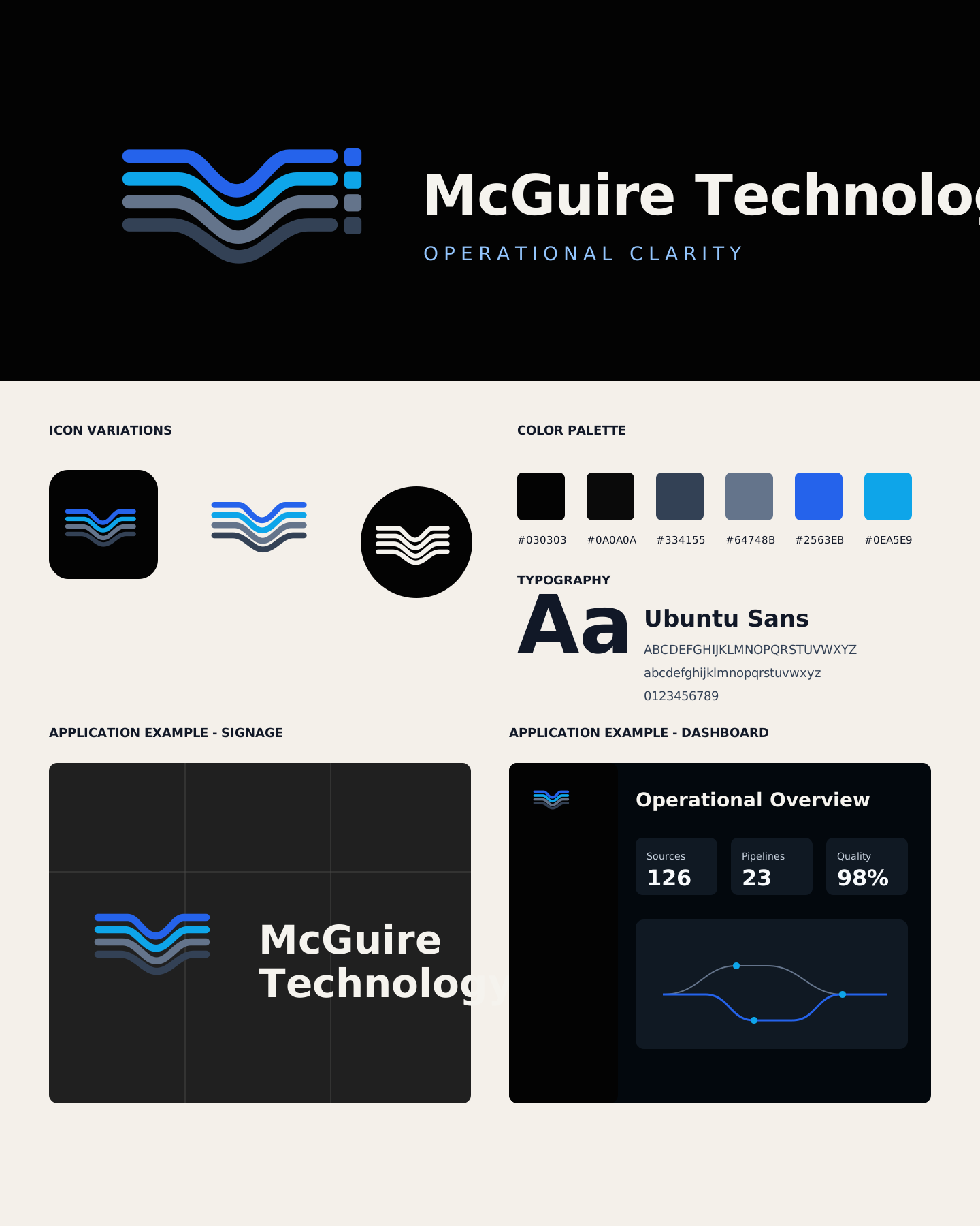
The current logo direction uses a routed single M built from four complete pipeline strokes. The mark should feel like data flow, infrastructure, observability, and operational systems without becoming a literal circuit-board icon.
 Primary lockup / dark
Use on black or dark panel surfaces.
 Primary lockup / light
Use on warm light surfaces and documentation backgrounds.
 Standalone mark
Use when the name is already nearby or space is constrained.
 App icon
Use for product shells, documentation favicons, and compact launch surfaces.
 One-color mark
Use for engraving, single-color documents, stamps, and low-color contexts.
 Reversed mark
Use as a compact white mark on black or deep slate backgrounds.
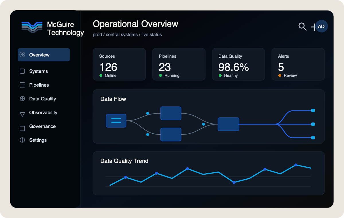
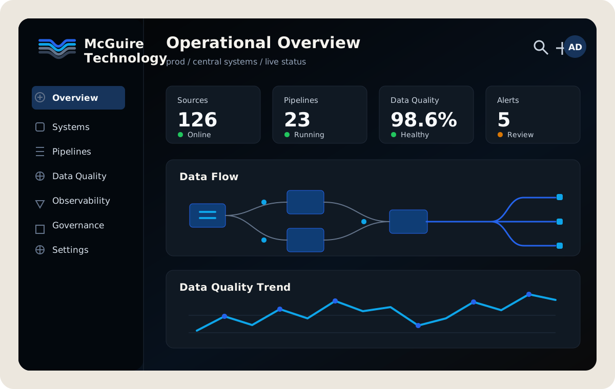 Operational dashboard
Dark product surfaces should use the mark as a quiet system identifier, with blue and cyan reserved for active data flow and selected states.
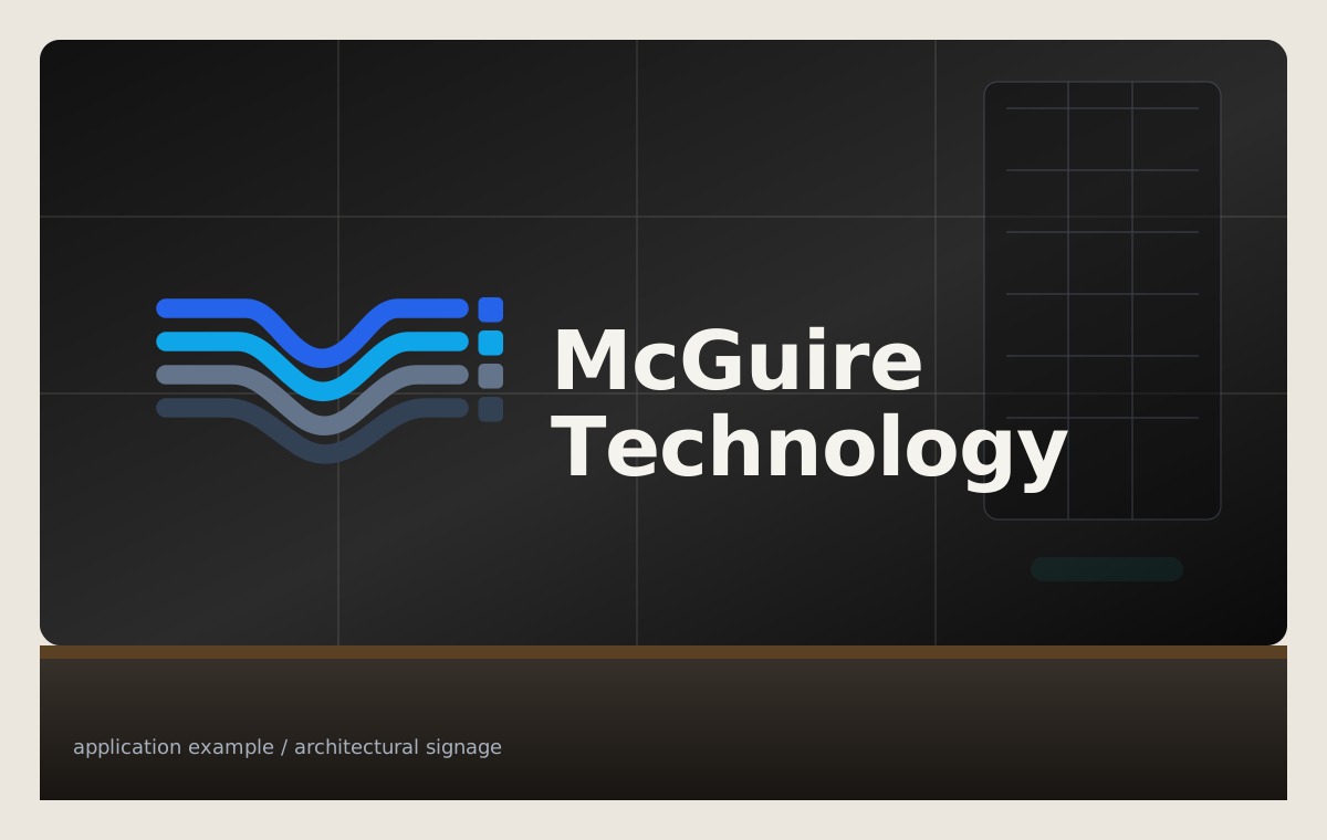 Architectural signage
Physical and large-format uses should preserve the full four-stroke mark, strong spacing, and high-contrast wordmark treatment.
Use SVG whenever possible. PNG versions are included for tools that cannot consume vector assets.
The base palette works as Missouri-rooted foundations: black flint, basalt bedrock, limestone bluffs, and bluff sand. These are the default surfaces the rest of the system should align to.
#030303The dark chert and flint found beneath Missouri soil. A foundation of strength and permanence.
#0A0A0AInspired by bedrock and stone. The reliable layer supporting systems and infrastructure.
#ECE7DEMissouri's limestone bluffs and caves. Bright, durable, and timeless.
#F4F0EAThe pale soils and weathered stone of Ozark bluffs. Warm, approachable surfaces.
Use a semantic accent set for meaning, not decoration. The accent colors should feel vivid on dark foundations and disciplined in light documentation surfaces.
#2563EBThe powerful currents of the Missouri and Mississippi Rivers. Primary actions, links, movement, and selected states.
#16A34AMissouri forests and conservation land. Success states, healthy systems, growth, and resilience.
#F59E0BRiver valleys at sunrise and sunset. Warnings, cautions, threshold notices, and important information.
#EF4444Missouri's state bird. Critical alerts, security threats, destructive actions, and urgent states.
#0EA5E9Where rivers and systems meet. Informational messages, orchestration, integration, and secondary actions.
#A16207The rich earth of Missouri riverbanks and farmland. Context, heritage, grounding, and metadata.
#C2410CCraftsmanship, industry, and enduring infrastructure. Premium features, achievements, and milestones.
Deep, enduring, and unseen. Use for the foundation of serious systems.
Solid and reliable. The bedrock your business can depend on.
Naturally strong and built to last, carved over time by what matters.
Warm, calm, and approachable. A surface built for focus and clarity.
Always moving forward. Driving action and creating connection.
Healthy systems grow strong together.
Clarity in important moments. Insight that helps you decide with confidence.
When it matters most, help people act fast and protect what they have built.
Bringing systems together and turning complex flows into simple outcomes.
Excellence is crafted, not given. Celebrate milestones and build the future.
| Purpose | Color | When to use |
|---|---|---|
| Primary actions / links | Current Blue | Calls to action, links, primary navigation |
| Success / healthy | Ozark Green | Completed tasks, healthy systems, positive change |
| Warnings / cautions | Golden Hour | Warnings, threshold notices, review states |
| Critical / errors | Cardinal Red | Errors, security threats, destructive actions |
| Informational | Confluence Blue | Informational messages and secondary actions |
| Heritage / context | Osage Clay | Context, environment, metadata, subtle accents |
| Premium / special | Forged Copper | Premium features, achievements, milestones |
Color combinations should meet WCAG 2.2 AA contrast standards for readability and accessibility. Do not rely on color alone to communicate state.
The palette should work cleanly in both dark and light interfaces. Dark mode uses a black base with dark surfaces, while light mode uses a warm gray-beige base for a calmer, more natural reading experience.
Use for dashboards, terminal-heavy systems, documentation shells, and high-contrast app surfaces.
Use for docs, proposals, open web surfaces, and interfaces that need a calmer, high-legibility baseline.
Use Ubuntu Sans as the default digital typeface. It is legible and practical, but it has enough warmth and recognizable character to keep the brand from feeling generic.
Use Ubuntu Mono for:
McGuire Technology
Use for documentation, product UI, navigation, labels, body copy, and most public brand surfaces.
Practical technology systems for operational clarity, automation, governance, and reliability.
ABCDEFGHIJKLMNOPQRSTUVWXYZ
abcdefghijklmnopqrstuvwxyz
0123456789 .,:;!?'"()[]{} / \ | @ # $ % & * + - =
< > ~ ^ _ ` TM ™ ® © § ¶
Operational Clarity
Use for page titles, section openers, pull quotes, presentation covers, and moments that need more brand character.
Systems built to last need language that feels calm, capable, and human.
ABCDEFGHIJKLMNOPQRSTUVWXYZ
abcdefghijklmnopqrstuvwxyz
0123456789 .,:;!?'"()[]{} / \ | @ # $ % & * + - =
< > ~ ^ _ ` TM ™ ® © § ¶
system.status = reliable
Use for code, CLI examples, IDs, config keys, environment names, version strings, and compact technical metadata.
deploy --target=prod --region=us-central-1
ABCDEFGHIJKLMNOPQRSTUVWXYZ
abcdefghijklmnopqrstuvwxyz
0123456789 .,:;!?'"()[]{} / \ | @ # $ % & * + - =
< > ~ ^ _ ` => -> :: && ||
99.98% uptime
Use Ubuntu Sans for metric labels and Ubuntu Mono for dense values that need alignment or quick comparison.
2026-06-09 22:14:08 UTC
+12.4% -03.8% 0.00042 8/16 nodes
McGuire Technology
Use for early wordmark studies, project mastheads, badges, lockup exploration, and strong brand moments.
MCGUIRE TECHNOLOGY™
McGuire / M / mcguire.tech / operations / controls
Use layouts that feel ordered and inspectable:
Avoid layouts that depend on decoration to feel complete. The brand should still feel strong with plain type, spacing, and structure.
Use:
Avoid:
For software products and internal tools, prefer:
Operational tools should feel efficient for repeated use, not like landing pages.
Use shadcn/ui components and semantic design tokens as the starting point for product interfaces. Reach for existing primitives such as Button, Card, Table, Badge, Tabs, Dialog, Sheet, Sidebar, Command, Alert, Empty, Skeleton, Tooltip, Select, Switch, Checkbox, and Slider before designing custom controls.